Skip to content

UI changes #903

New issue

Have a question about this project? Sign up for a free GitHub account to open an issue and contact its maintainers and the community.

By clicking “Sign up for GitHub”, you agree to our terms of service and privacy statement. We’ll occasionally send you account related emails.

Already on GitHub? Sign in to your account

Merged
merged 8 commits into from
Dec 16, 2022
Merged

UI changes #903

merged 8 commits into from
Dec 16, 2022

Conversation

PapyElGringo
Copy link
Collaborator

Add some UI changes:

  • replace panel drop shadows by divider
  • add panel drop shadow when left panel is open
  • uniformize tabs appearances (Window list and Workspace list)
  • improve scalability of interface

Copy link
Contributor

@HalfVoxel HalfVoxel left a comment

Choose a reason for hiding this comment

The reason will be displayed to describe this comment to others. Learn more.

Nice!
Couldn't spot many of the changes, but it does now look better when using display-scaling. And the ripple effect works again.

Copy link
Contributor

@HalfVoxel HalfVoxel left a comment

Choose a reason for hiding this comment

The reason will be displayed to describe this comment to others. Learn more.

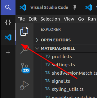
Actually. I very much preferred when the workspace indicator was on the left side. Having it on the right side makes it much harder to see since it's close to a lot of other colors (especially since I think you've also made it thinner).
image

@PapyElGringo
Copy link
Collaborator Author

I wanted to uniformise the tabs indicators from the horizontal and vertical panel and since the material design guidelines for horizontal tabs is to place the indicator on the content side I did the same for the vertical ones. And I indeed changed the size to fit the guidelines too

@PapyElGringo
Copy link
Collaborator Author

Note that there is also now an highlight to the button like it was the case on the horizontal ones which help to notice but I also had a weird feeling at first too maybe habit?

@HalfVoxel
Copy link
Contributor

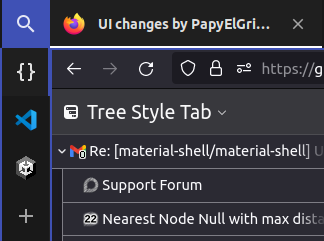
Well. I imagine for most material-design apps, you can actually control what is on the content side and make sure it works ok. In our case the content can be completely arbitrary and that makes it very hard to read imo.

It also somewhat merges with the 'active' window border now (if you have that enabled).
image

@HalfVoxel
Copy link
Contributor

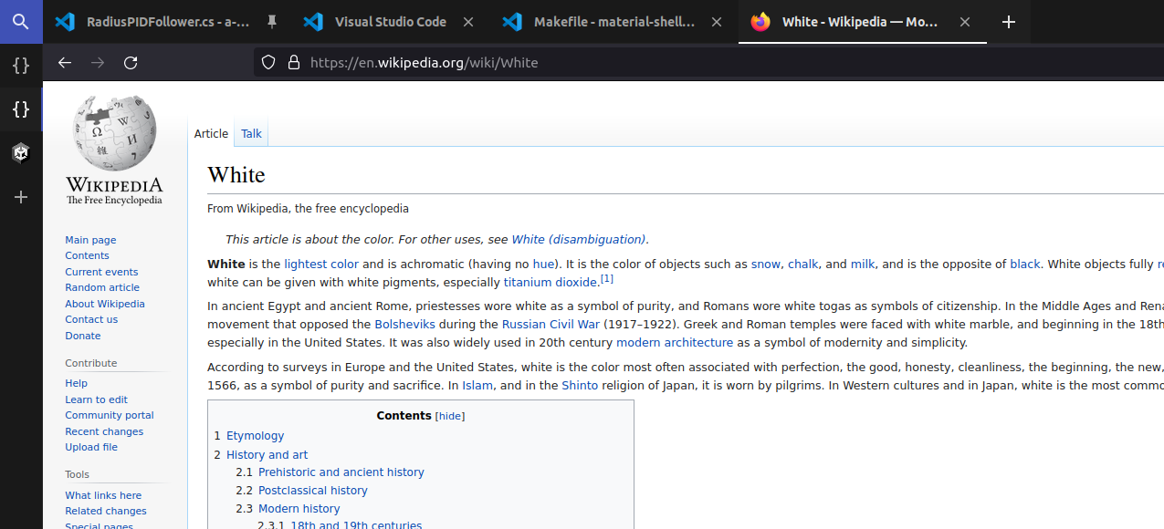
For the horizontal tabs it works much better because white is much more high-contrast than blueish. Those tabs are also much wider, and the color along the top of windows tends to be uniform (in contrast to the color along the left side).

@HalfVoxel
Copy link
Contributor

I also find it almost impossible to see easily when the content is white. Even though I have a pretty good monitor, it's really hard to spot a 2px blueish border between a very dark region and a very white region:
image

@HalfVoxel
Copy link
Contributor

Any update on this?

@PapyElGringo
Copy link
Collaborator Author

Any update on this?

I'll revert the position change on the left panel and merge it

@HalfVoxel
Copy link
Contributor

Sounds good!

@PapyElGringo PapyElGringo merged commit 2d1c2b5 into main Dec 16, 2022
@PapyElGringo PapyElGringo deleted the ui_refresh branch December 16, 2022 22:19
Sign up for free to join this conversation on GitHub. Already have an account? Sign in to comment
Labels
None yet
Projects
None yet
Development

Successfully merging this pull request may close these issues.

2 participants