How to Change Line Color in Matplotlib?
Last Updated :
28 Apr, 2025
Matlab's plotting functions are included in Python by the Inclusion of the library Matplotlib. The library allows the plotting of the data of various dimensions without ambiguity in a plot. The library is widely used in Data Science and Data visualization. In this article, we will discuss how to change line color in Matplotlib. Since Matplotlib is an external library it can be installed on the machine by running the following command:
pip install matplotlib
Changing line color using plot
The default color used for a line in Matplotlib is blue. The plot function used to plot data takes in an optional argument for color, i.e., If the argument is provided, the color associated with the argument would be used to plot the line. The color value could be provided to the function in various ways, such as:
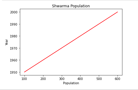
Example 1: Using initials of color names ("g" for red)
Firstly the x-axis and y-axis labels are defined, along with the title for the plot (for demonstration). Then a line is plotted on the 2d plot using the function plot, and the string orange is passed as the second argument to the function. This argument determines the color of the plot line. Therefore the plotted line in the output is of orange color rather than the default blue color.
Python3
import matplotlib.pyplot as plt

# Adding X and Y axis label
plt.ylabel('Year')
plt.xlabel('Population')

# Adding title to the plot
plt.title("Shwarma Population")

# Plotting x and y axes and line color to orange
plt.plot([100, 200, 300, 400, 500, 600], [
         1950, 1960, 1970, 1980, 1990, 2000], 'orange')

plt.show()
Output:

Example 2: Using color names ("red" for red)
Then a line is plotted on the 2d plot using the function plot, and the string green is passed as the second argument to the function.
Python3
import matplotlib.pyplot as plt

# Adding X and Y axis label
plt.ylabel('Year')
plt.xlabel('Population')

# Adding title to the plot
plt.title("Shwarma Population")

# Plotting x and y axes and line color to orange
plt.plot([100, 200, 300, 400, 500, 600], [
         1950, 1960, 1970, 1980, 1990, 2000], 'g')

plt.show()
Output:

Example 3: Using color codes ("FF0000" for red)
Then a line is plotted on the 2d plot using the function plot, and the string red is passed as the second argument to the function.
Python3
import matplotlib.pyplot as plt

# Adding X and Y axis label
plt.ylabel('Year')
plt.xlabel('Population')

# Adding title to the plot
plt.title("Shwarma Population")

# Plotting x and y axes and line color to orange
plt.plot([100, 200, 300, 400, 500, 600], [
         1950, 1960, 1970, 1980, 1990, 2000], 'g')

plt.show()
Output:
Changing line color using set_color
This time the plot function is called to plot the line without any color argument. The plot function returns at first a Line2D instance. This plotted line is saved in a variable named line. Later the line.set_color method is called on this variable to change the line color to yellow (passed as an argument to the function). The plot is displayed below.
Python3
import matplotlib.pyplot as plt

# Adding X and Y axis label
plt.ylabel('Year')
plt.xlabel('Population')

# Adding title to the plot
plt.title("Shwarma Population")

# Plotting x and y axes and line color to orange
line, = plt.plot([100, 200, 300, 400, 500, 600], [
                 1950, 1960, 1970, 1980, 1990, 2000])

# The previously defined line had the default color of blue
# Now that color is changed to pink
line.set_color("yellow")

plt.show()
Output:

Similar Reads
Change matplotlib line style in mid-graph Prerequisite: Matplotlib In this article we will learn how to change line style in mid-graph using matplotlib in Python. Matplotlib: It is a tremendous visualization library in Python for 2D plots of arrays. Matplotlib may be a multi-platform data visualization library built on NumPy arrays and desi
2 min read
Line chart in Matplotlib - Python Matplotlib is a data visualization library in Python. The pyplot, a sublibrary of Matplotlib, is a collection of functions that helps in creating a variety of charts. Line charts are used to represent the relation between two data X and Y on a different axis. In this article, we will learn about lin
6 min read
How to change a color bar in Plotly in Python In this article, we will learn how to change a color bar in Plotly Python. Different types Color-Scale names for Plotlyaggrnyl    burginferno    plasma    rdpu     ylgnbu    mattergeyseragsunset   burgyl    jet      plotly3redorylorbr    solarpiygblackbodycividismagenta    pubu
2 min read
How to plot a dashed line in matplotlib? Matplotlib is used to create visualizations and plotting dashed lines is used to enhance the style and readability of graphs. A dashed line can represent trends, relationships or boundaries in data. Below we will explore how to plot and customize dashed lines using Matplotlib. To plot dashed line:Sy
2 min read