

Quantitative analysis of population-scale family trees with millions of relatives
- PMID: 29496957
- PMCID: PMC6593158
- DOI: 10.1126/science.aam9309
Quantitative analysis of population-scale family trees with millions of relatives
Abstract
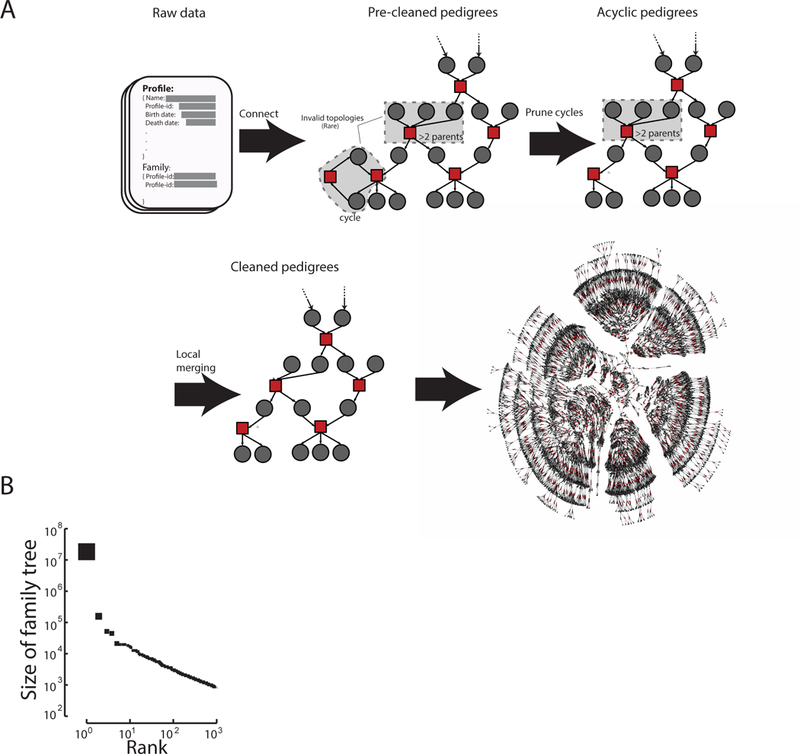
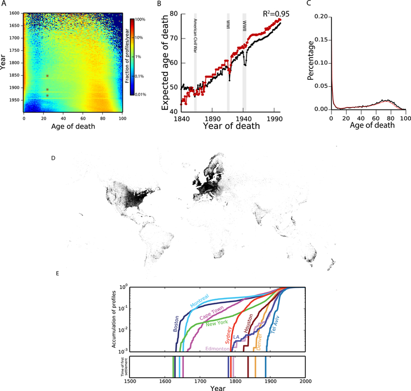
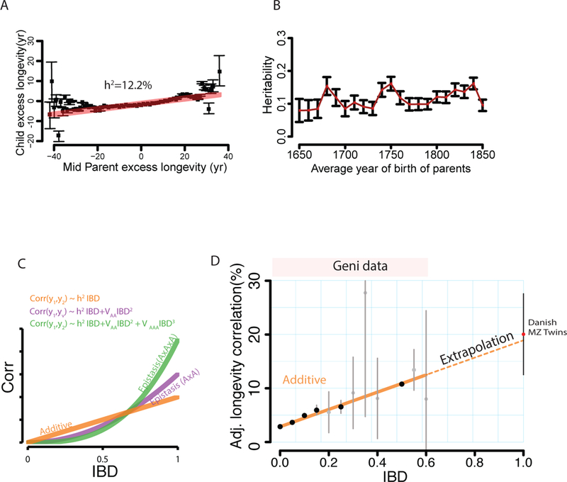
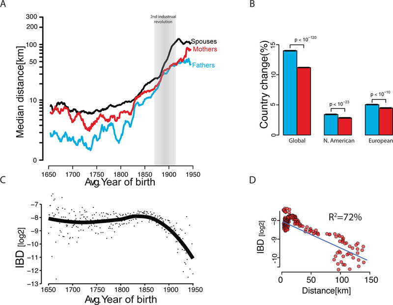
Family trees have vast applications in fields as diverse as genetics, anthropology, and economics. However, the collection of extended family trees is tedious and usually relies on resources with limited geographical scope and complex data usage restrictions. We collected 86 million profiles from publicly available online data shared by genealogy enthusiasts. After extensive cleaning and validation, we obtained population-scale family trees, including a single pedigree of 13 million individuals. We leveraged the data to partition the genetic architecture of human longevity and to provide insights into the geographical dispersion of families. We also report a simple digital procedure to overlay other data sets with our resource.
Copyright © 2018 The Authors, some rights reserved; exclusive licensee American Association for the Advancement of Science. No claim to original U.S. Government Works.
Figures
Comment in
-
Human genetics: Population-scale family trees from publicly available data.Nat Rev Genet. 2018 May;19(5):250-251. doi: 10.1038/nrg.2018.16. Epub 2018 Mar 26. Nat Rev Genet. 2018. PMID: 29576614 No abstract available.
-
Crowdsourced genealogies and genomes.Science. 2018 Apr 13;360(6385):153-154. doi: 10.1126/science.aat2634. Science. 2018. PMID: 29650659 Free PMC article. No abstract available.
Similar articles
-
Estimating variance components in population scale family trees.PLoS Genet. 2019 May 9;15(5):e1008124. doi: 10.1371/journal.pgen.1008124. eCollection 2019 May. PLoS Genet. 2019. PMID: 31071088 Free PMC article.
-
[Genetic aspects of genealogy].Genetika. 2011 Nov;47(11):1451-72. Genetika. 2011. PMID: 22332404 Review. Russian.
-
Genetic genealogy comes of age: perspectives on the use of deep-rooted pedigrees in human population genetics.Am J Phys Anthropol. 2013 Apr;150(4):505-11. doi: 10.1002/ajpa.22233. Epub 2013 Feb 26. Am J Phys Anthropol. 2013. PMID: 23440589
-
Should police have access to genetic genealogy databases? Capturing the Golden State Killer and other criminals using a controversial new forensic technique.PLoS Biol. 2018 Oct 2;16(10):e2006906. doi: 10.1371/journal.pbio.2006906. eCollection 2018 Oct. PLoS Biol. 2018. PMID: 30278047 Free PMC article.
-
The Y chromosome as the most popular marker in genetic genealogy benefits interdisciplinary research.Hum Genet. 2017 May;136(5):559-573. doi: 10.1007/s00439-016-1740-0. Epub 2016 Nov 5. Hum Genet. 2017. PMID: 27817057 Review.
Cited by
-
Aging Skeletal Muscles: What Are the Mechanisms of Age-Related Loss of Strength and Muscle Mass, and Can We Impede Its Development and Progression?Int J Mol Sci. 2024 Oct 11;25(20):10932. doi: 10.3390/ijms252010932. Int J Mol Sci. 2024. PMID: 39456714 Free PMC article. Review.
-
From mutation to mechanism: deciphering the molecular function of genetic variants linked to human ageing.Brief Funct Genomics. 2022 Jan 25;21(1):13-23. doi: 10.1093/bfgp/elab005. Brief Funct Genomics. 2022. PMID: 33690799 Free PMC article.
-
The persistent homology of genealogical networks.Appl Netw Sci. 2023;8(1):15. doi: 10.1007/s41109-023-00538-7. Epub 2023 Feb 23. Appl Netw Sci. 2023. PMID: 36852178 Free PMC article.
-
Applications of multi-omics analysis in human diseases.MedComm (2020). 2023 Jul 31;4(4):e315. doi: 10.1002/mco2.315. eCollection 2023 Aug. MedComm (2020). 2023. PMID: 37533767 Free PMC article. Review.
-
Biomarkers of Aging and Relevant Evaluation Techniques: A Comprehensive Review.Aging Dis. 2024 May 7;15(3):977-1005. doi: 10.14336/AD.2023.00808-1. Aging Dis. 2024. PMID: 37611906 Free PMC article. Review.
References
Publication types
MeSH terms
Grants and funding
LinkOut - more resources
Full Text Sources
Other Literature Sources
Medical
